The complete guide to custom packaging design for Saudi restaurants and cafes in 2026 — building visual brand identity, applying it across cups, bags, and boxes, navigating the design approval process, and avoiding the six most expensive design mistakes.
Custom packaging design is the step that transforms a restaurant from "just another place to eat" into a brand that customers remember, return to, and recommend to others. The visual identity expressed through your packaging is the one brand touchpoint that reaches customers at the moment of highest emotional engagement — when they are receiving and opening their food. Research consistently shows that consumers associate packaging quality with food quality — a finding that directly translates to menu pricing power and customer loyalty. In Saudi Arabia's hyper-competitive restaurant and cafe market, packaging design has become a genuine business differentiator. The cafe that serves the same quality coffee as its competitor but presents it in a beautifully designed, branded cup consistently outperforms on repeat visit rates, social media mentions, and willingness-to-pay. This guide is the complete resource for custom packaging design for Saudi restaurants and cafes — from building your visual identity to applying it across your full packaging system, navigating the production process, and avoiding the design mistakes that cost time and money.
Who This Guide Is For
This guide is for every restaurant or cafe owner who wants packaging that reflects their brand identity — whether designing from scratch, updating an existing design, or standardizing packaging across multiple branches. It covers both the creative and the practical: what makes a great packaging design, how to work with a designer, what the approval process looks like, and how to avoid the mistakes that waste production budgets.
Visual Identity for Packaging Starts Before the Design. The most important packaging design work happens before a designer opens any software. A brand visual identity that is not clearly defined before the design process begins produces inconsistent, committee-driven results that look different on every packaging item — the opposite of a coherent brand. The questions to answer before starting any design work: Who is your customer — specifically? (Age range, lifestyle, values, how they discover restaurants, what they expect from their packaging.) What feeling do you want your packaging to create? (Premium? Playful? Authentic? Technical? Traditional? Modern?) What is your single most important brand message? (Quality? Speed? Health? Heritage? Community?) Which brands in other categories — not just food service — do you admire visually? (These references help a designer understand your aesthetic direction far more precisely than verbal descriptions.) What should customers think about your restaurant immediately upon seeing your packaging? Answering these questions precisely before engaging a designer saves revision rounds, reduces costs, and produces a more coherent final result.

Restaurant packaging design guide for Saudi Arabia 2026 — story-driven design, sustainable packaging, Instagram-optimized packaging, bold color trends, QR code integration, seasonal design, and implementation costs.

Complete guide to wholesale packaging discounts for Saudi restaurants 2026 — annual contracts, volume discount tiers, multi-item consolidation, upfront payment discounts, Ramadan pre-order strategy, and G-Pack wholesale pricing.
Brand Colors — A Decision With More Weight Than Most Owners Realize. Color is the most immediately recognized element of any brand identity — preceding logo recognition by approximately 60-80ms in consumer perception research. This means that before a customer consciously reads your logo, they have already experienced an emotional and associative response to your brand color. The principles for choosing packaging brand colors: Distinctiveness — choose a color that your most direct competitors in your immediate geographic area do not own. Brand color recall requires singularity: the customer should associate that specific color primarily with you. Emotional alignment — colors carry culturally consistent emotional associations in the Saudi market: red stimulates appetite and urgency, green signals freshness and health, black communicates premium and sophistication, kraft brown suggests authenticity and craft, white implies cleanliness and precision. Printability — some colors that look excellent on screen print inconsistently on paper cup and bag materials. Highly saturated neons, very light pastels, and certain purples behave unpredictably in flexographic printing. Always print a sample before committing a color to production. Scalability — your brand color should work at all scales: on a 4oz espresso cup and on a large family bag. Test your color at both extremes before finalizing.
Typography — Expressing Brand Personality More Powerfully Than Most Owners Expect. The typeface used in your packaging design expresses your brand's personality with an immediacy and precision that surprises many restaurant owners when they see comparison examples side by side. A serif typeface (with small decorative strokes at letter endings) communicates heritage, tradition, quality, and trustworthiness. A geometric sans-serif communicates modernity, precision, and technical confidence. A hand-lettered or script typeface communicates warmth, authenticity, and personal craft. A bold display typeface communicates strength, confidence, and energy. The most common typography mistake in restaurant packaging: using more than two typefaces. Every additional typeface dilutes brand consistency and creates visual noise. Professional packaging design uses one primary typeface (for the brand name and main messaging) and one secondary typeface (for supporting information). These two typefaces should be complementary but clearly distinct in weight or style — not so similar that the difference is subtle. For packaging printing, minimum readable type size is 7-8mm height for primary text. Anything below 5mm height risks losing legibility, especially on textured surfaces like kraft paper.
| Printing Method | Color Limit | Design Complexity | Best Design Approach | Minimum Type Size |
|---|---|---|---|---|
| Flexo | 1-4 Pantone spot colors | Simple to medium | Bold solid colors, large clear logo | 7mm+ height |
| Digital | Unlimited CMYK | Complex OK | Full color photography, gradients possible | 5mm+ height |
| Offset | Full CMYK + Pantone | Complex OK | Photography, fine illustration | 4mm+ height |
| Silkscreen | 1-2 specialty inks | Simple only | Large logo or text, no fine detail | 8mm+ height |
| Design Element | High-Impact Application | Risk When Neglected | Cost to Implement |
|---|---|---|---|
| Brand color on cup/bag | First impression before logo read — most powerful recall element | Generic look — no differentiation from competitors | Included in standard print cost |
| Logo size and placement | Primary recognition element — must be readable from arm's length | Small or hidden logos lose brand exposure opportunity | Included in standard print cost |
| Tagline or brand statement | Communicates your brand promise at every touchpoint | Missed opportunity for emotional connection | Included in standard print cost |
| Social media handles | Drives organic social sharing and follower growth | Lost potential for every customer who would have shared | Included in standard print cost |
| QR code to menu or loyalty | Bridges physical packaging to digital customer journey | Static packaging vs. interactive brand experience | Low — SAR 0.01-0.03 per unit added |
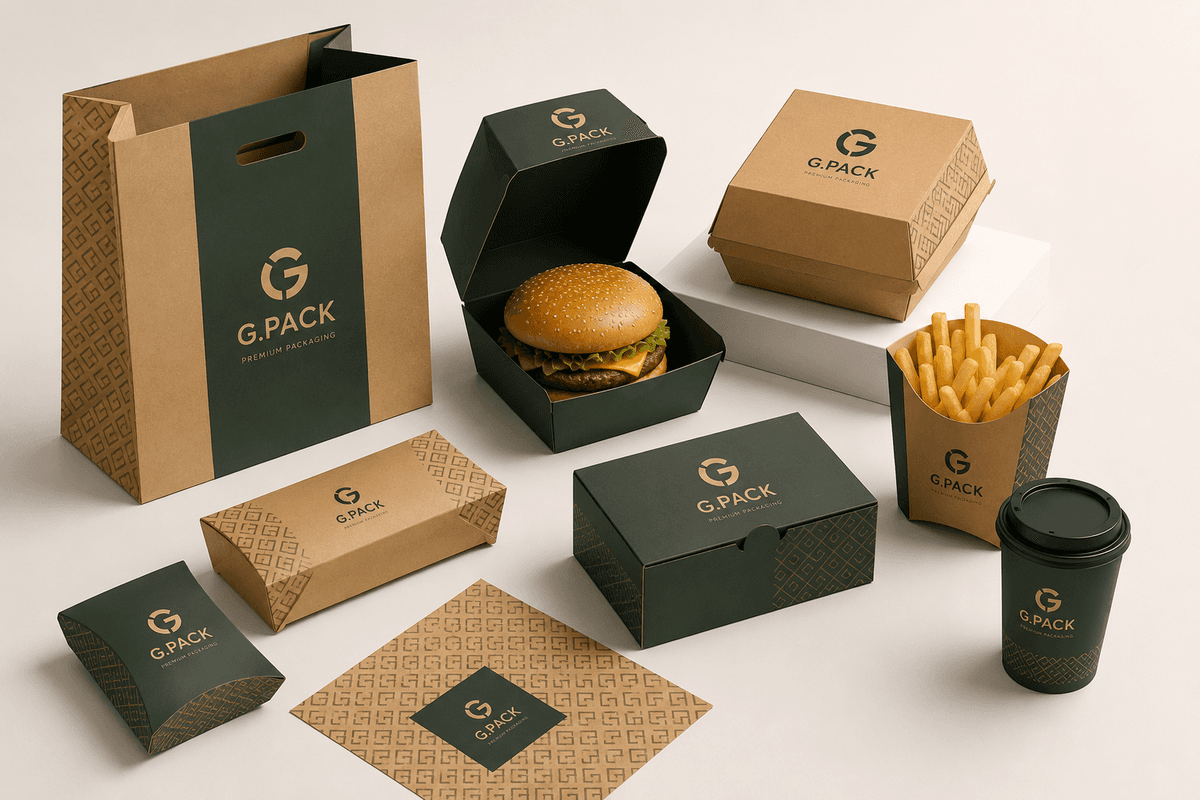
Applying Your Visual Identity Across Different Packaging Items. Once your visual identity is defined — logo, colors, typeface, and brand personality — applying it consistently across cups, bags, boxes, and accessories requires format-specific adaptation, not mechanical reproduction. A design that works beautifully on a flat paper bag does not automatically work on a cylindrical cup. Each packaging format has different dimensions, viewing angles, surface characteristics, and structural constraints that must inform how the design adapts. For cups: the cylindrical surface means the design must work when seen from one of three angles — straight-on, angled from above, or seen as the customer carries it. The design must also work in the curved plane, not just in flat view. For bags: the two visible faces (front and back) and the gusset provide a generous flat surface — ideal for more detailed designs. The bag is seen from the front and sides simultaneously when carried. For boxes: the top surface is the first thing the customer sees. The sides are seen next. Design hierarchy should reflect this viewing sequence — most important brand element on top. The practical approach: work with a designer who has experience specifically with packaging templates, not general graphic design. Provide them with the actual die-cut templates for each packaging item and insist that all design work is done on the template, not on a generic rectangle.
The Design Approval Protocol — Never Skip These Steps. The single most expensive mistake in packaging production is approving a design on screen and then discovering significant issues when the first physical production samples arrive — after plates are engraved and production has begun. A structured approval protocol prevents this: Step 1 — Digital proof review: review the design on a proper calibrated screen. Check all text for spelling, sizing, and placement. Confirm all brand elements are present. Check that no critical elements fall in bleed or cut zones. Step 2 — Print simulation: view the design printed on a standard office printer at full size. This is not a color-accurate representation, but it reveals scale issues — elements that look appropriately sized on screen often look wrong at actual cup or bag dimensions. Step 3 — Physical pre-production sample: for any order above 500 units, request one physical printed sample before approving full production. This is the only true color and surface quality check. Review it under natural daylight — not office or warehouse lighting, which distorts color perception. Step 4 — Structural function test: fill the sample cup with hot water and hold for 5 minutes. Assemble a burger in the sample box. Fill the sample bag with your heaviest typical order. These tests reveal any structural compromises introduced by the production process.
Answer these questions in writing before your first designer meeting: Who is your target customer (age, values, lifestyle)? What feeling should your packaging create? What is your one most important brand message? What brands in any category do you admire visually? What should customers think immediately upon seeing your packaging? This brief is the design's north star — return to it every time a decision becomes difficult.
Research your 5 most direct local competitors. What colors do they use on their packaging? Avoid these colors — your packaging must be visually distinctive. Choose 1 primary brand color and 1 supporting color maximum. Test both colors in print before finalizing.
Get the flat die-cut template for every packaging item from your supplier before starting any design work. Send these templates to your designer. All design work must be done on these actual templates — this prevents the most common and most expensive packaging design error.
Digital proof review. Print simulation at full size. Physical pre-production sample review in natural daylight. Structural function test with actual food. Never skip step 3 — the physical sample — for any order above 500 units.
Print your design on brown kraft paper, white coated paper, and your cup material. View it in natural light and in the artificial lighting typical of your restaurant. Your design must work on all surfaces and in all lighting conditions where customers will encounter it.
Once your first production run is approved and delivered, create a simple brand style guide: primary color Pantone code, secondary color Pantone code, typeface names, logo minimum sizes, and approved usage examples. This document ensures consistency across all future orders, even when working with different designers or suppliers.
The Unboxing Experience — The Detail That Separates Good Packaging From Exceptional Packaging. The moment a customer opens your packaging is the highest-engagement brand interaction they have with your restaurant — more impactful than seeing your social media post, passing your storefront, or receiving your delivery notification. Exceptional packaging design considers what the customer experiences at every stage: seeing the outside of the bag or cup, opening or removing the lid, and seeing the food inside for the first time. Elements that create memorable unboxing moments: a small, beautifully printed thank-you card inside the bag ("Thank you for choosing [Name] — we made this for you"). Distinctive tissue paper inside the bag. A wax-sealed sticker on the outer bag that the customer must break to open. A printed interior surface inside the burger box — visible only when opened. Each of these elements adds SAR 0.05-0.25 to your per-order cost and creates a moment of genuine surprise that customers photograph and share on social media with far higher frequency than standard unboxing experiences.
| Design Approach | Upfront Cost | Quality Outcome | Time to First Production | Best For |
|---|---|---|---|---|
| Professional packaging designer (experienced) | SAR 2,000–8,000 one-time | Excellent — brand-ready | 3-5 weeks (design + approval) | Any restaurant planning to scale |
| Generalist graphic designer | SAR 800–3,000 one-time | Variable — risk of non-print-ready output | 2-4 weeks | Small operations with close design supervision |
| Design template customization (G-Pack or supplier) | SAR 0–500 | Good — functional, not distinctive | 1-2 weeks | Start-up, cost-constrained, need quick launch |
| AI-generated design | SAR 0–200 | Inconsistent — legally uncertain for trademarks | 1-3 days | Not recommended for brand packaging |
| Freelance platform (Upwork/Fiverr) | SAR 150–1,200 | Variable — requires careful brief and revision budget | 1-4 weeks | Works with very specific brief and packaging experience requirement |
The 6 Most Expensive Packaging Design Mistakes
1. Overcrowded design — too many elements create visual chaos on a small surface. Less is always more on packaging. 2. Lines thinner than 0.5pt — disappear or blur in flexo printing. Minimum 1pt for all lines. 3. Colors chosen for screen appearance, not print behavior — always get a printed physical sample before approving production. 4. Typography too small — minimum 7mm character height for any text that must be read. 5. Logo placed too close to fold or cut lines — gets cut off or distorted in production. Minimum 5mm clearance from all edges. 6. Approving design without a physical sample — the most expensive mistake; always request a physical pre-production sample for any order above 500 units.
Common Challenges in Restaurant Packaging Design Projects — And How to Avoid Them. Challenge 1: The designer produces a beautiful flat design that does not work on the cylindrical cup surface. Solution: always work with a designer who has packaging-specific experience. Provide actual cup die-cut templates and require all design reviews on the template, not on a flat canvas. Challenge 2: The first printed sample has colors that look significantly different from the screen design. Solution: specify your brand colors as Pantone codes, not hex codes. Pantone codes are printer-universal; hex codes are screen-only. Challenge 3: Fine detail in the design — intricate patterns, thin lines, small text — disappears or blurs in flexo printing. Solution: review all final artwork against minimum specification requirements (1pt minimum line weight, 7mm minimum text height). Challenge 4: Design approved for cups is applied directly to bags without adaptation, resulting in poor brand coherence. Solution: treat each packaging format as a distinct design project, adapting the brand elements to the specific format rather than mechanically reproducing them. Challenge 5: Seasonal design changes required for Ramadan, National Day, or Eid result in high costs from new plate engraving. Solution: design your seasonal packaging to change only the decorative elements while keeping the primary brand structure (logo, colors) identical. Many printers can update only one plate in a 2-color run, reducing the seasonal change cost significantly.
Brand Identity Consistency Across Your Complete Packaging System. A brand that looks slightly different on each packaging item is not a brand — it is a collection of loosely related items. True brand identity consistency means: the same Pantone color appears on every item, from the small sauce cup to the large family bag. The logo is sized proportionally relative to each surface area and always has the same relationship to the edge of the surface. Typography is the same typeface family across all items. The overall visual impression — before any specific element is consciously registered — feels unified and purposeful. Achieving this consistency requires: a formal brand style guide distributed to every packaging supplier and every designer involved in your packaging. Annual review of all packaging items side by side to identify and correct drift. A single responsible person internally who owns the brand standard and reviews every new design approval against it. The cost of maintaining this consistency is the time investment to create the style guide and the discipline to enforce it. The return is a brand that customers remember — and return to.
Schedule a 2-hour session to write your brand brief: target customer profile, desired packaging feeling, single most important brand message, visual references you admire, and what you want customers to think upon seeing your packaging. This document guides every design decision.
Specifically brief designers on packaging experience: ask to see examples of their work on cups, bags, or boxes — not just flat print work. Provide your complete brand brief and all packaging templates at the initial meeting.
In your design brief and all design files, specify brand colors using Pantone Matching System (PMS) codes. These codes translate directly to printer inks. Convert any existing hex codes to Pantone equivalents before briefing any printer.
Never approve any new custom printed packaging item above 500 units without a physical pre-production sample. Review under natural daylight. Test with actual food. This step costs 1-2 weeks but prevents very expensive full production run reprints.
After your first successful production run, document: Pantone colors (primary + secondary), logo minimum sizes, typeface names, approved usage examples on each packaging type. Share with every supplier and every designer involved in your packaging.
Once per year, lay all your active packaging items side by side and evaluate visual consistency. Is the color consistent across all items? Is the logo relationship to surface area consistent? Is the typeface consistent? Any item that drifts from the standard should be corrected on the next reorder.
Professional packaging-experienced graphic designers charge SAR 2,000-8,000 for a full custom packaging design project covering cups, bags, and boxes. Generalist designers (lower packaging-specific experience risk) charge SAR 800-3,000. G-Pack offers template-based design customization at low cost for operators who need a fast, functional result. For any restaurant planning long-term growth, a professional packaging designer is the highest-ROI creative investment you will make.
Four steps: (1) Work with a designer experienced in packaging formats, not just screen design. (2) Specify brand colors as Pantone codes. (3) Review artwork against minimum specification requirements (1pt minimum lines, 7mm minimum text). (4) Always get a physical pre-production sample and review it in natural daylight before approving full production.
No — adapt your visual identity to each format, do not reproduce it mechanically. Your logo, colors, and typography should be consistent across all items, but the layout and composition should be optimized for each format's dimensions, viewing angle, and surface characteristics. A cup design needs to work when wrapped around a cylinder. A bag design needs to work when seen on two flat faces.
Vector files in .ai (Adobe Illustrator) or .pdf format, at 300dpi minimum resolution for any raster elements. All fonts must be converted to outlines (curves) to prevent font substitution. Include Pantone color codes for all spot colors. The file should be at actual production size with 3-5mm bleed on all sides. If your designer works in Photoshop only, they are not a packaging designer.
Your core brand design — logo, primary color, main layout — should remain stable for a minimum of 3-5 years. More frequent changes undermine brand recognition accumulation. Seasonal design updates (Ramadan, National Day, Eid) can occur annually for a subset of packaging items — typically the outer bag, which carries the most seasonal visual impact. The strategic standard: stability for recognition, limited seasonal updates for relevance.
G-Pack helps Saudi restaurants create custom packaging designs that build brand identity, drive customer loyalty, and look exceptional at every touchpoint. Consultation, design templates, and production — all in one place.
Get a Free Quote